14 June 2020
Runner's World - Best Summer Tops

Fantastic to see our Purity top featured in the June edition of Runner's World magazine!
The full-page image really does the print justice, and is accompanied by a nice little brand profile.
It's great to be introduced to new customers, which is invaluable to a small brand like us. It all helps, particularly in the difficult times we are all facing.
Thanks Runner's World!
26 May 2020
Runners World - 8 small British brands
In these uncertain times for everyone, we really appreciated being featured on the Runner's World website and newsletter in April, as part of a group of small British brands to support during lockdown.

Here is the link to the article
13 February 2020
Deciphering the Code

The print design process:
the creation of the Dot Dash print
For our new collection of tops, we wanted to create a subtle print, an all-over, textural, shaded design. Taking landscapes, sea and sky as initial inspiration, I played around with some painterly effects, but was looking for a way to continue the graphic style from the previous collection.
Design and colour inspiration can come from a variety of resources: we have a collection of fabrics in the studio from previous projects, and among these are some vintage Irish tweeds, with colours reminiscent of lichen and moss, rock and stone. Their irregular, slubby weave made me think of rounded dots and dashes, shapes that I could use to create a graphic, vector design.

The initial inspiration of sea, sky and storm also tied in with the idea of dots and dashes, with seafarers' use of Morse code to broadcast encoded communications. So, as is our way, I set about creating a design that isn’t just about how it looks. This is a design that you can read.
What looks like a random series of dots and dashes, on closer inspection, reveals messages to inspire and encourage. Morse code has been used vertically, each word a different shade, and the design has been mirrored for symmetry.As with all our styles, the print design is fitted into each piece of the pattern that makes up the garment, and is adjusted for each size. I designed the print in vector format using Adobe Illustrator, a mathematical design process which enables adjustments with no loss of print quality.

Colours have been chosen for their richness, inspired by land, sea and sky. A tapestry of moss shades, deep teals, silvery sage and hot corals for men, and for women, forest moss, dark red berry shades, sparkling sea blues, and rich amber tones.

17 November 2019
The Tortoise and the Hare
If it's worth doing, it’s worth doing it well, however long it takes.
We have been absent for a while, but this is slow, considered clothing that will last - not throwaway, fast fashion. We have been working hard finding more suppliers that meet our standards, without us having to commit to large quantities that require us to overstock.
When we first started Fervour six years ago, we initially looked for UK suppliers, so that we could keep our range manageable and under control. We have now found new UK and European suppliers who can create garments to our standards and with our unique take on activewear, without us having to order large quantities or compromise our style.
The good news is that having found great new suppliers, we can now offer more size choices and unique colour and print options, in smaller quantities.
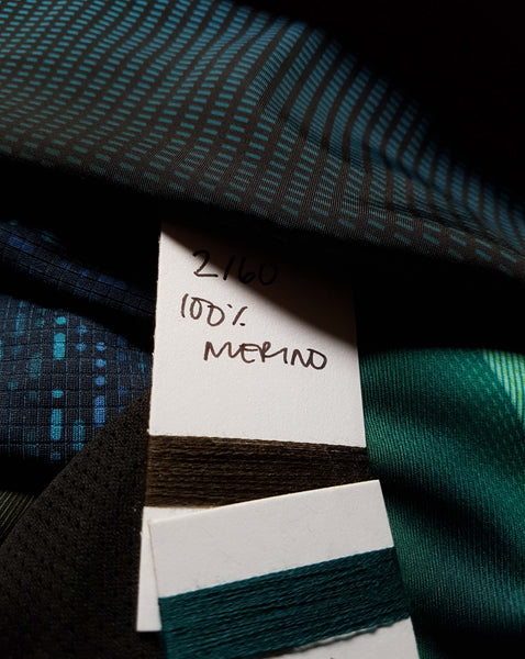
Fervour will be adding to our family of garments starting this month with our merino collaboration with Foxology.
More releases will come over the coming weeks.
04 September 2019
In The Works
There are things in the works at Fervour. Here's a sneak peek of our upcoming products - using new sustainable fabrics and fibres!
Make sure you're following us on Facebook, Twitter and Instagram to keep up with updates. More announcements soon!